
When I first start a new project I like to pitch multiple visual directions to the team, to garner feedback and to try to get everybody on board. As I think of visual directions I keep in mind various factors, does the look work with the theme and style of the game, will the look be competitive and how will it stand out from the crowd. Of course I never forget the main purpose, we are making a game and not a piece of art, so the art direction always needs to support the game.
My first task on Brothers in Arms was to understand the game as a whole, see the games theme and the tone, is it real, comedy, somber, jingoistic. After that it’s off to do a reference search and this is as broad as possible and not just limited to games or a specific competitor. Inspiration can come from anywhere, commercials, music videos, films, TV, comic books, artists, graphic design movements, I also like to do a breakdown of relevant games, I do this by looking at 5 factors, Form, Color, Texture, Design and lighting. Ubisoft really wanted to see how the new direction would compare with the previous Brothers In Arms games. Here is how I broke it down for them.

So once I finished the research I came up with a few ideas for the art direction and as I believe passionately that making a game is a collective effort I sent my first pass at possible directions to the entire team to get feedback and see what resonates and what gets no traction. At this stage there’s no point in going into great detail as some or all directions might be totally disliked. So here below are the initial 5 directions I started with along with an approach to the graphic design of the game.
1: Bleach Bypass
Inspiration; Saving Private Ryan, Pitch Black, Three Kings, Se7en, Minority Report.
A relatively popular technique for cinematographers and directors trying to give their films a unique visual style has been Bleach Bypass or more commonly now a digital facsimile of this process. The effect can be varied in its effect but basically it produces a high contrast low saturation image usually with a high level of noise or film grain, the degree of these effects is controlled and allows for a wide range of ‘looks’ as is evident by the variety of films that use it. Here are some stills from movies that show the look.


So, what would BIA Hells Highway look with this treatment?
 Reference;
Bleach bypass; http://en.wikipedia.org/wiki/Bleach_bypass
Saving Private Ryan; http://www.theasc.com/magazine/aug98/five/index.htm
2: Documentary
Inspiration; Memphis Bell, Pathe News, Newsreel
The Documentary style could visually range from the drastic to the mild. It could look exactly like the footage shot at the time, very high contrast black and white with no HDR, the skies would be almost totally white, the frame rate could vary as if shot by hand cranked camera giving the jerky unrealistic speed to the animations, there would be many artifacts and film degradation overlaying the screen, the film itself would vary in brightness and flicker slightly as the game is played. A less drastic approach that would still have some period relevance would be to mimic the early color film or the colorized effect on restored black and white footage. This would give the game a historical look with a de-saturated color palette with high contrast and deep black shadows and we could also introduce film artifacts to enhance the aged appearance. We could also take a modern approach to a documentary look again keeping the de-saturated, high contrast noise look but with less artifacts.
We could also take the Documentary vibe into all parts of the game, there could be a narrator who’s voice over’s could explain the historical context of the missions allowing the in game cinematics to focus on Bakers story, the Documentary flavor would also carry over to the tutorials.


Reference;
Memphis Belle; http://military.discovery.com/video/memphis-belle.html
B&W Documentary; http://video.search.yahoo.com/video/play?p=ww2+film+footage
Color Footage; http://video.search.yahoo.com/video/playm163928477
3: The Hire
Inspiration; BMW short film series.
This would involve a collection of different styles that would overlay the emotional arc of the game, with the Patton Charge to victory it could be like the film ‘Beat the Devil’ Tony Scott vide, with the high contrast vibrant colors and the spot screen effects, while during the emotional down sections it could have the heavy documentary style of the ‘Powder Keg’ very de-saturated, noisy with a hand held camera effect.
Here are some shots of Beat The Devil.


And some shots from Powder Keg.

 Reference;
Beat the Devil; http://www.youtube.com/watch?v=ADzTu2NM8Lg&feature=related
Powder Keg; http://www.youtube.com/watch?v=FgOOU0z_Pik&feature=related
Star; http://www.youtube.com/watch?v=mrLYQnjzH7w&feature=related
Ticker; http://www.youtube.com/watch?v=mNoYLm3a-nI&feature=related
The Follow; http://www.youtube.com/watch?v=mNoYLm3a-nI&feature=related
4: Propaganda
Inspiration; Borderlands, Mad World, Prince of Persia, Renaissance
We are currently working on some test for this look as it can vary greatly within the ‘Propaganda’ umbrella. We could try to vary the effect over distance, the background would be entirely graphic with the mid-ground being a mix of the graphic and realistic textures before reaching the completely realistic foreground giving the player the mix of the far away distorted ‘reality’ of Propaganda coming closer to home and reality as it get closer to the player. It could of course just be a straight attempt at a graphic propaganda style using either a painterly, watercolor style and palette for the textures or push it to the graphic design limits of duo tone and harsh lines.


5: Tony Scott
Inspiration; Domino, Man On Fire, Déjà Vu.
Although superficially similar to the Bleach Bypass Tony Scott has a distinct style of his own that does incorporate the bleach bypass and other simulated chemical treatments, he also uses much more color, sometimes super saturating the colors, he also plays with film speed, overlays and text elements all mixed together over the length of his films.


Reference;
Tony Scott; http://en.wikipedia.org/wiki/Tony_Scott
Graphic Design
Inspiration; WW 2 Propaganda, Shepard Fairy.
The graphic design for BIA Victory in Europe will be heavily influenced by the style of WW 2 Propaganda, although WW 2 Propaganda covered a wide spectrum of style and techniques we will focus more on the graphic design style as opposed to the more painterly examples. Within these parameters we could stick with a very authentic approach using the same colors, typography and design sensibilities which would bring a level of authenticity to the game but we probably want to update the look melding the old with the new, the work of Shepard Fairey has taken some elements of this into his work.

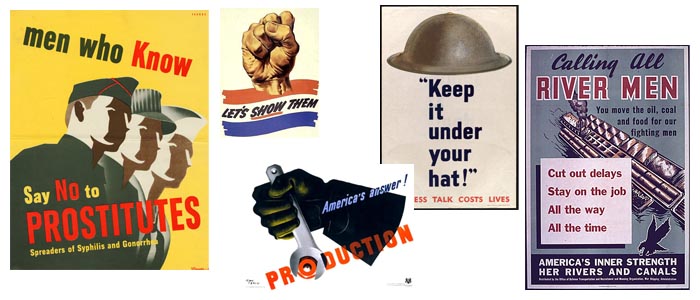

Reference;
Shepard Fairey; http://obeygiant.com/ http://en.wikipedia.org/wiki/Shepard_Fairey
Final Art Direction.
After pitching these art directions I listened to all the feedback I could get and embarked on defining a final art direction. This gallery contains and explains the ‘Adrenaline Crunch’ final art direction. I used these slides to show everyone where we were going.


As we all know in the game industry there’s a fair amount of pivoting and the game changed leadership who wanted to move away from a realistic Brother in Arms sequel into a less rigid and less faithful direction to WW2.
As this happened many of the team had trouble grasping this new direction so I wanted to come up with a single image that would try to encompass the new direction, so I worked with concept artist Matias Tapia to illustrate how I envisaged the change. I drew inspiration from the pulp books and magazines from the 50’s to 60’s, so I designed this poster and Matias painted the background.

And finally a gallery of the 6 locations in the game, either in concept at by Matias Tapia or in game shots.


